December 19, 2009


Need some typographic inspiration? Great images of holiday typography. Check out the latest news from the type theory archives. ( http://www.typetheory.com/ )

December 2, 2009

UAB Students Tour Atlanta Studios


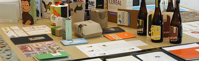
On November 12th, members of the UAB graphic design program along with students from Samford University and Montevallo University spent the day touring Design Studios in Atlanta. Over 30 students participated in the tours. Students were also treated to a tour of MAC Paper's Design Center and were able to take home paper samples and promos. Above, students talk with Chris Miller of the Jones Group. The tour was a joint venture between the schools and the local AIGA Birmingham chapter. We wish to thank everyone who graciously gave time and effort: Mac Papers - Andrea Hill, Mohawk Papers - Rebecca Pilgrim, The Jones Group, Fletcher-Martin, Primal Screen, Unboundary and the AIGA Birmingham.

September 24, 2009

45 Beautifully Designed Book Covers


The great people at well medicated have compiled their list of the 45 most beautifully designed book covers. Book cover design has come a long way in the last 25 years, thanks Chip Kidd !
Got to their site and check it out.

Adbusting in Berlin


Great Photoshop Adbusting of a boring advertisement which you see everywhere in Berlin, Germany: Britney Spears, Leona Lewis and Christina Aguilera selling their albums. The adbusting was done by the FTW crew (Mr. Tailon, Baveux Prod., Kone & Epoxy) and consists of overlaying the image with stickers from Adobe Photoshop’s interface panels. See all the photos... 

September 17, 2009

I want!


Yet another feature I must have on my own card!  Local design student, letterpress owner and bon vivant Patrick Masterson showed me a sample of his latest work. The effect, called "edging" is done by stacking 200 cards together, then airbrushing the color, by hand, on the edges. Apparently the rage right now with the "in" crowd. It is really striking in person! I asked if there was anything stopping him from doing it in GOLD, and his answer.. in perfect Patrick tone "good taste?"

These are printed on Crane-Lettra, letterpress paper by Crane. http://www.cranepaper.com/lettra/home.html


September 12, 2009

IKEA's Type Troubles


Thumbing through his local Swedish newspaper, Göteborg resident Mattias Akerberg found himself troubled by a full-page advertisement for Ikea. It wasn't that the Grevbäck bookcases looked any less sturdy, or that the Bibbi Snur duvet covers were any less colorful, or even that the names given to each of the company's 9,500 products were any less whimsical. No, what bothered Akerberg was the typeface. MORE> 

Logo Trends 2009


September 7, 2009

2009 Breakaway Brands, Landor Associates

Saffron Article on Brand Building

Brands used to be a guarantee of good quality. A product that did what it said on the tin laid a foundation of trust between consumers and a product. The likes of Disney, Coke and Sony built their reputation on consistently delivering quality products. ‘Sophisticated’ marketing, advertising and tag lines followed much later. See the complete article at Saffron!

Saffron's New Identity for LITRO.


Litro /

How can you succeed in the über-competitive European service station market? Powerful brands crave for our attention on European highways. Our challenge was to create an attractive brand to compete in the cut-throat market of gasoline distribution.

A clean slate is always a great place to start. And that was precisely our approach to this issue, a re-definition of the service station. Together, with our client Rompetrol (Romania’s challenger to incumbent Petrom) and Eight Inc. architects we have rethought the service station. The answer is Litro, a concept as simple and compelling as its name. See the complete article at Saffron!